
Kintsugi, wasn’t the initial idea we had for our project, but the analysis and the observation of the area and its problems, reminded us this Japanese art of repairing broken pieces and It became the concept we adapted to the whole project.
Congratulations on winning 1st prize. What aspect(s) of your project do you think made it stand out among the others?
First of all, thank for the appreciation shown on our project. We are really happy about that!
Despite the level of the projects in competition was really high, we think our project won the 1st prize because based on a deep analysis who allowed us to understand all the problematics of the area (quality of the space, sociology, different ages and uses) and to develop a polyhedric, feasible and effective project, in line with the tradition of the site.

Both cut-out people and axonometric icon people are used in your visualizations. Is there a style you prefer specifically?
No, there is not a preferred style we use for our projects. We usually like to experiment new techniques and we also consider the feasibility, in relation with the time we have to produce our job. Moreover, each member of the team has a different background and each of us has been involved in different topic (analysis, masterplan, render,..). Since we all had to produce different images, we choose a ‘’line’’ to follow, based on 2D images post-producted in Photoshop and we all adapted our styles to that.
Did you draw every detail in the project? Did you used any readymade content?
Yes, we drew all the details in the projects. Of course, we took as a reference real and existing details already built, and we made a mix and match that we changed and re-adapted to our project.
How do you choose color palettes? Do you have certain packages ready in advance or do you design them specifically according to the project? What are your criterias in terms of creating a color palette?
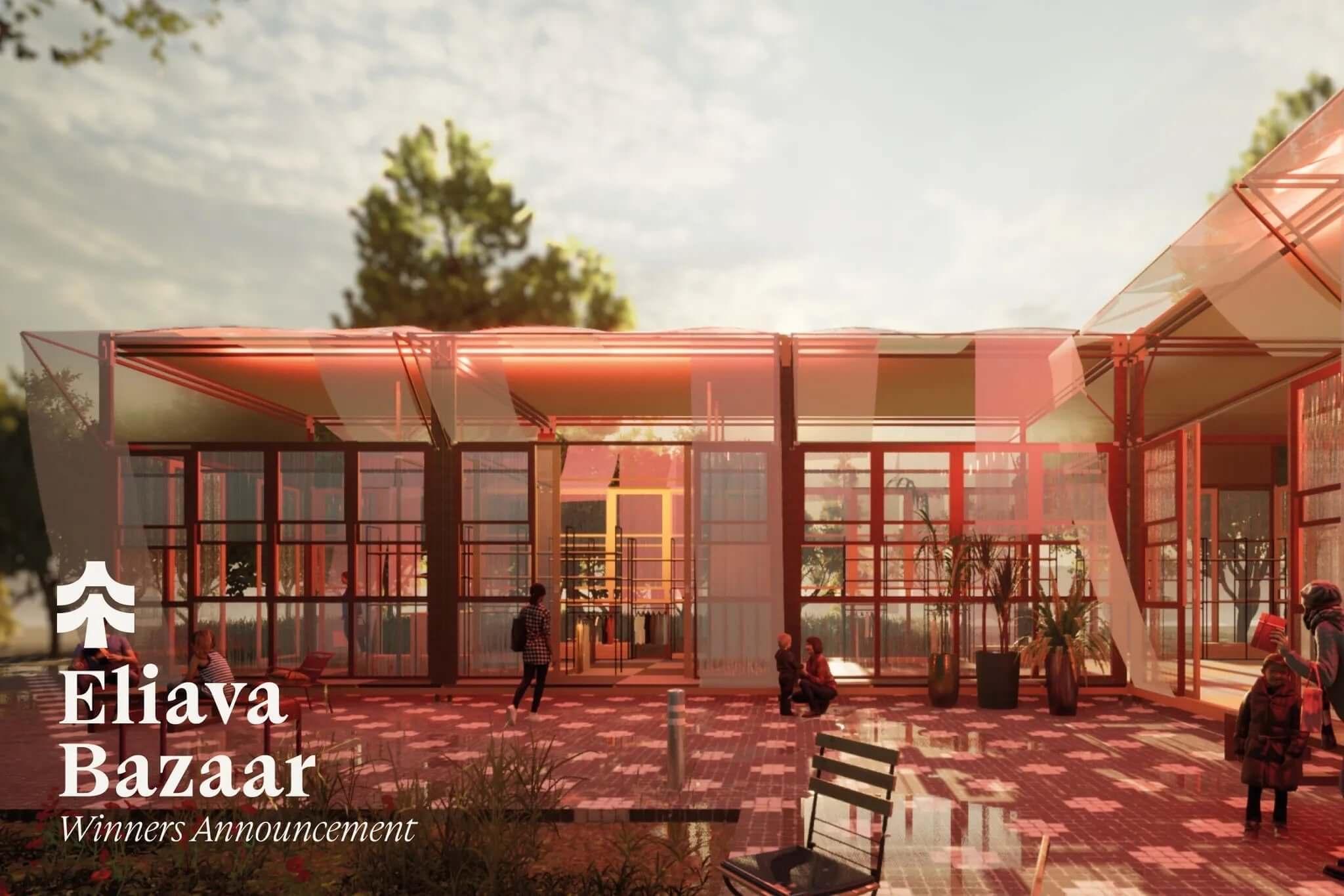
The color palette for this project, comes from the observation of the typical colors of the area. In Kintsugi, are predominant light and warm colours who recalls the “Pietra di Trani” and all the natural stones belonging to the Mediterranean Area.
Just for the playground, we used a different color palette, outstanding, and made by blooming colours with the aim of balancing the ‘’pastel’’ feeling of the overall space and creating an attractive spot for the users.
Kintsugi is defined as a Japanese art of repairing broken pottery by mending the areas of breakage with lacquer dusted or mixed with powdered gold, silver, or platinum. How this specific form of art has influenced your visuals?
More than the visual, we would say it influenced the vision. Kintsugi, wasn’t the initial idea we had for our project, but the analysis and the observation of the area and its problems, reminded us this Japanese art of repairing broken pieces and It became the concept we adapted to the whole project. We didn’t have to change our initial idea, it was just the perfect fit ever!
In sections, you have placed 0real building facade photos on the elevations. We see that this technique transformed rather simple models into a beatiful elevation collage. Is there any specific reason you used this technique? Do you use this technique on your other visuals? Was it something you done specifically for this project?
Collages of urban facades have always been part of our background, since university. In the case of Kintsugi, we rectified every single picture and we merged all of them, in order to create a reliable and recognizable facade in a quite ‘’short amount’’ of time. This, helped also the jury and the citizens with understanding and orientation when they were looking at our drawings.
Are there any other styles or designers that you are inspired by, like their work, use as a reference? Who or what has been the biggest single influence on your way of thinking? What is your main source of inspiration?
Yes, we have different inspiration when we have to approach to our projects: for Kintsugi, for instance, mainly Zean Mcfarlane e Fala Atelier for the visuals; Teresa Gali- Izard, Alvaro Siza, BIG, for the project and specifically Aldo Van Eyck for the playground. Other inspiration sources for the graphics are Pinterest, Archdaily and of course TOFFU.
How much time do you typically spend working on visualization? Do you break the process up to some stages like drafting and post-production?
It depends on the kind of visualization we want to adopt for our projects (wheter post-production or realism with render engines). Sure is that, for every project, we go deeply in this field and sometime we analyze different techniques, choosing the most suitable for our needs and the needs of the project.
What's the most challenging and the most time-consuming part of graphic design and visualization for you?
Mainly, the most time consuming and challenging tasks are the initial settings: detailing the 3D (or the 2D image), preparing the bases, setting the overall lighting and rectifying images for collages.
Everybody has his own style which is effective in its way.
Do you use a graphics tablet?
For some steps, as the concept phase and the post-production is a fundamental tool. For Kintsugi, it has been essential during the first brainstorming to work on quick and easy concept images.
It says you use Ps, Ai, Autocad and Rhino. What's the program you feel most comfortable with? What other softwares and hardware do you use?
We feel much comfortable with Photoshop for sure. For other kind of jobs, we use a lot of different softwares like V-ray, Sketchup, Revit (to mention some of them).
MacOS or Windows?
We all use Windows (and we are happy with it!).
Was there a shortcut you were so pleased to learn over the years?
Definitely S (stretch) in Autocad, Ctrl+J (duplicate layer) in Photoshop and Ctrl+Shift+Alt+V (Paste in place) in Indesign.
What tip and tricks can you give our readers to improve their illustration skills? Is there any trick you use to strengthen your visual narrative?
We don’t have any real trick to suggest in order to improve the skills. Everybody has his own style which is effective in its way. We would just suggest the basic, like working with perspective, using some rules based on photography and working with images composition, looking at references, different styles and observing the environment to understand how materials, lights and colours behave.
Are there any other mediums or forms of art you like to work in?
Yes, we also work with Land art, Photography, Illustrations and Music.
The patterns you used in your previous project "Artistic Installation"are very colorful and interesting. Canvas and acrylic paint were used in this study, do you prefer traditional media over digital? Do you think your interest in traditional media is affecting your visual style?
For this specific installation, we decided to focus on a traditional style to show our affinity to the art of Illustration, which is fully part of our background. More in general, we prefer to work with digital media rather than traditional media.
In the INCAVA project, you gave texture to the moon, land, even people in visuals, was this a deliberate decision made with your aesthetic style? Can we also say that you are using textures in a symbolic way? Your final works don’t have a high-quality rendering image, can we say that it is your style not to move away from the sketch style? What are your thoughts on realistic render images?
The use of the textures for INCAVA has definitely a more symbolic and abstract approach which can be related to ‘’visual brutalism’’. We use this style because we didn’t want to give a realistic aspect to our images. As we said, we always adopt a different style for our projects.
We don’t exclude that, in the next project, we will work more with realism (whether in post-production or with a render engine). Realism is a really effective way to represent some kind of projects such as interior design or during the last phases of a project.
Thanks!
Source: Toffu


Comments (0)
Back to Architecture News